Skip down to page content.

Real Estate Information Archive

Blog

Displaying blog entries 1-4 of 4

Breaking the Rules of Decorating

by Tucker Robbins

Decorating is the most personal way to express yourself in your home, and sometimes, when you want to try something different--something that doesn’t seem to fit anywhere on the list of design rules--it may be tempting to go with the flow, despite what you want to do.  Get design-rebellious with these tips: 


Color 

  • - Small room?  It doesn’t have to be a neutral color!  Go bold but create balance with open shelving or smaller furnishings. 

  • - We’re told not to stick with one color in a room, but going monochrome creates a bold, dramatic statement. 

  • - Your ceilings can be considered another wall when it comes to color.  Just remember to keep the walls a neutral color and get samples to paint on the ceiling before you commit to it. 

  • - Trim doesn’t have to be white!  Use high-gloss black for drama, stain that complements wood flooring, or neutrals for a modern twist on a traditional look. 


Finishes 

  • - If the metal finish on your kitchen light fixture doesn’t match the drawer pulls, it’s fine!  Mixing metals is perfectly acceptable, and check out this article from the Invaluable blog for inspiration! 

  • - Wood finishes don’t have to be the same throughout the house; create dimension with different stain colors, adding depth to a room or the whole house. 

  • - Who said tile is only for kitchens and bathrooms? Create an accent wall with tile in any room.  Be inspired by using the HGTV photo library search for whatever room you have in mind and add “wile tall” to the search term.   

  • - Speaking of kitchen tile, why not use wallpaper for your backsplash?  Protect it from splashes and oils with mounted plexiglass or a sealant made especially for sealing wallpaper. 


Furnishings and Accessories 

  • - Furniture stores have us fooled into thinking that our furniture sets must match, and this logic applies to even pieces like dining chairs. Mixing styles adds interest. 

  • - Mixing more than two patterns can be scary, so start small with accessories in bold patterns that are easily changed.  Staying in the same color family with your patterns will made this decision less daunting. 

  • - If you’d like to add some natural pieces to your space but don’t have a green thumb, then don’t be ashamed to use artificial plants!   

  • - It’s tempting to just scoot furniture to the wall and leave it because you want to follow symmetry.  Go diagonal!  Check out the difference a rearrangement can make by placing the sofa at a slant and give it a try in your living room! 


Not all rules of design should be broken, and there are likely rules that tell us why going against the norm with our personal decorating has a great result.  If you want to do something different, try it--you may like it! 


Courtesy of New Castle County DE Realtor Tucker Robbins

Design Trends for Fall/Winter 2020

by Tucker Robbins


Autumn is here, believe it or not, and thinking about spending even more time inside during the colder months may not sound at all exciting. How much you enjoy that time inside is up to you, and sure, holiday decor can help lift spirits, 
but for the in-between, what is on trend for the upcoming Fall and Winter? 


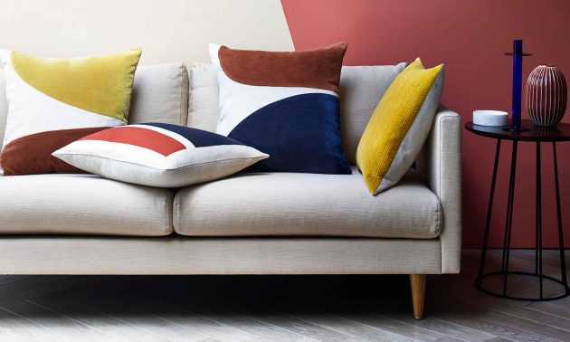
  • For your color palette, earthy tones will continue to be popular:  browns, beiges, and colors of the sky such as light blue, grays, and even shades of orange.  Warm up neutral backgrounds with warm colors like cinnamon, yellow (think turmeric!), and red. 
     

  • Contrasting design is hot, and it does not matter if the contrast comes from color, or design elements.  
     

  • Exposed brick is taking over the wooden plank focal point.  Creating a faux brick wall from brick veneer is a simple DIY. 
     

  • Whether you are considering a large furniture purchase or just looking for accessories, check out end tables or other pieces in dark wood, and a leather-covered ottoman or pillows. 
     

  • Plaids are continuing to be a favorite, and using it is as easy as a plaid throw on your favorite chair. As tartans can be busy, opt for neutral plaids in two or three colors, like black and white. 
     

  • If you love the look of trendy wallpaper, but don’t like the commitment, why not try a temporary brand?   Floral wallpaper is still a popular print and does not seem to be letting go in the upcoming Winter months. 
     

  • Brass. No, not the shiny brassy brass of the 1990s, but antiqued brass is a warm way to add metals to your decor. Mixed metals are still a trendy look, too.  Incorporate metals into your decor with lamps, an ottoman, or an accent table. 
     

  • Now, the kitchen/dining room combo is nothing new but has not been very popular in recent years. The desire for this kind of multifunctional roomamong others, is on the rise as we are at home more, and may need our spaces to do double duty.   


Many trends for the back half of 2020 have changed over recent months.  Making your home a comfortable and cozy place to spend the colder months of the year have many benefits to your mental well-being, too, so choose a few easily changed out trendy accessories to your decor for an updated, modern look. 


Courtesy of New Castle County DE Realtors Tucker Robbins and Carol Arnott Robbins.  

Photo credit: ideal home

How To Make Your Living Spaces Appear Larger

by Tucker Robbins


If the furniture in your living space looks like it’s just stuffed in the room, there are ways to make your space 
seem larger.  Check out these tips to create more space in your home: 


  • - Use mirrors to fool the eye, because they reflect light and images. Hang one larger mirror on the main wall, several small ones, (gallery style), or even an oversized mirror leaned against the wall.   

  • - Painting walls a light color automatically opens up the space to the eye, because it reflects light.  Going all one color is a great way to make the room appear larger, too. 

  • - Get rid of clutter.  The more you have sitting around--mail, books, work, kids’ school things--the fuller your space looks.  Baskets, files or paper organizing gadgets, decorative storage containers, or furniture pieces that double as storage are the best way to hide necessary things.  Get rid of, (in other words, throw away or recycle), junk mail and unnecessary paper as soon as you look at it. 

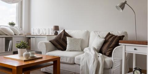
  • - Draw an imaginary diagonal line across your room and place your furniture at an angle.  You even get a bonus storage area behind anything that covers a corner! 

  • - Pieces that are the same color as the walls blend in, making the room appear larger. 

  • - Either skip window coverings, or use sheer drapery or curtains and blinds that are the same color as your walls.  If you have to use drapes, hang them either at ceiling height, or just inside the window so the framework is visible. 

  • - If you want bookshelves, consider a wall-to-wall, floor-to-ceiling unit.  Draw the eyes horizontally and vertically. 

  • - Speaking of bookshelves, the less you have on these open spaces, the roomier it looks.  Cramming every collection, book, or “trinket” just fills up the space in a similar way that clutter does. If you must display sentimental pieces, display a few at the time.  Switching them out on occasion will also give new appreciation for them. 

  • - Choose sofas and chairs with exposed legs to allow to light to pass through underneath them.  The more light in your room, the better. 

  • - On that note, light is your friend.  If you can’t get more natural light into the space, use a few lamps instead of an overhead light, as it draws the eye to look around the room. 

  • - Keep patterns small.  Use a punch or two of larger patterns on pillows or throws, but not too many--remember--less is more. 

  • - If you need an area rug, don’t settle for a small rug under the coffee table.  Purchase a rug that extends out from the furniture, as it will draw the eye out. 

  • - Create a focal point with framed pieces on one wall, especially behind a sofa, and extend the arrangement to the ceiling, and it will make the space appear taller.  It will also add pop and take away from the room’s size.  

  • - Drop-leaf tables or dining tables with the extra leaf removed work best in small areas, and if you need more tabletop space for guests or for workspace, simply add the leaf. 


Small spaces can still mean big living--we just have to make a few adjustments to maximize the space and create a few illusions for our minds to think big.  Better Homes and Gardens has multiple ideas for small spaces, from apartments to living areas, as well as those awkward spaces. 


Courtesy of New Castle County DE Realtors Tucker Robbins and Carol Arnott Robbins.   

Photo credit: nearsay

Home Decorating and Design Trends for 2018 for New Castle County, DE

by Tucker Robbins

A new year means that new home decorating and design trends are being featured in magazines, on blogs, and at home shows.  If you like to stay on top of the newest ideas and get an itch to get to the paint store when you see the most recent magazine layouts, here are just a few of things that are trending now. 


  • - In spite of what we see on house flipping television shows, the open floor plan is losing some popularity.  People are starting to define their open spaces with small partitions, paint, and other clever ways. 
     

  • - Natural things like wood, botanical prints and florals are still hot.  Wood is still king in the flooring department, and wallpapers and fabrics will be featuring natural prints. 
     

  • - For kitchen countertops, quartz is moving up the ranks because of its beauty and ease of care--it doesn’t need sealing like marble and granite, and it’s also heat resistant. 
     

  • - Accent walls are painted in bold colors, or covered with wood or bold-printed wallpapers. 
     

  • - Metallic pieces are making a comeback.  Finishes in brass and even stainless black are taking over stainless steel and brushed nickel.  Good thing that mixed metals are an acceptable look. 
     

  • - Larger tile on floors and backsplashes are coming in style, but the classic subway tile is still number one because of the clean, classic look it has. 
     

  • - Concrete is showing up in unusual places, like flooring and walls.   
     

  • - Smart technology is being integrated into almost every room of the house, including the bathroom


    -Vanity mirrors with smart screens built in, chromatherapy, and touch-free fixtures are becoming more popular and affordable.   


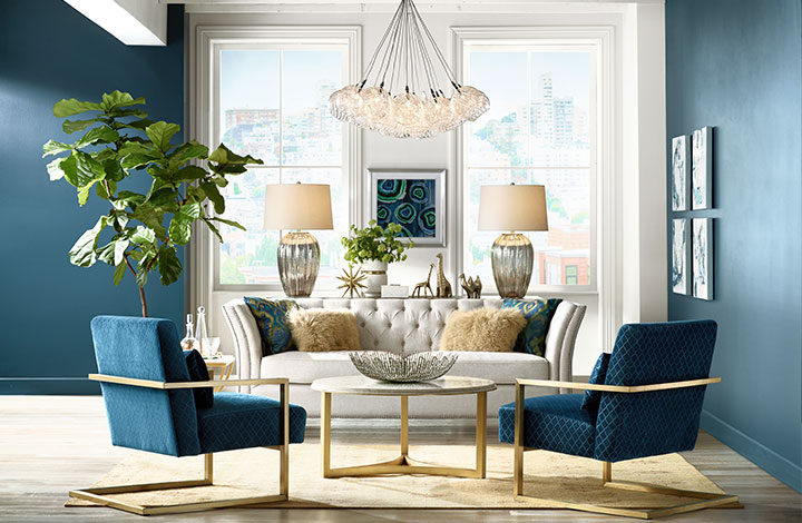
    - Trends in lighting are still leaning towards the vintage look, but pendants are especially stylish, and brass is the new brushed nickel. 


    The definition of trend, according to Merriam-Webster, is “a prevailing tendency or inclination; a general movement.”  In other words, trends are temporary, even if they last for years. Make it easy on yourself if you love a new look, and try a few ideas in your home, but don’t undergo a complete remodeling to meet today’s en vogue styles.  Stick to easily changeable trends, such as throw pillows, slipcovers, paint, and wall coverings.


    Courtesy of New Castle County DE Realtors Tucker Robbins and Carol Arnott Robbins.   

  •  

    YOUR HOME SEARCH STARTS HERE

    FIND OUT WHAT YOUR HOME IS WORTH 


    Photo credit: lampsplus.com

Displaying blog entries 1-4 of 4

Syndication

Categories

Archives

Quick Search

Contact Information

Photo of Tucker Robbins Real Estate
Tucker Robbins
Berkshire Hathaway HomeServices
3838 Kennett Pike
Wilmington DE 19807
(302) 777-7744 (direct)